API of you - Glucoseproject
 - April 18, 2018
For the midterm in “API of you” we had to collect a dataset based on ourselves. From the data we had to create a .json file that would display our collected information in an interesting way.
I decided to base my project on blood glucose. Blood glucose has been a central topic many times during my time in biology, however I have never had the opportunity to continuously test my own. Especially, since coming to ITP - I haven’t really been able to keep up with my exercise, sleeping and eating habits. This may have had an impact on my daily blood glucose making it an interesting test in a project that had to be about ourselves.
I bought a glucose-testing-kit on amazon. The idea was to test my blood glucose 4 times each day. I looked up information on blood glucose and found that especially these times would be critical to get an accurate estimation of blood glucose levels:
- morning.
- before my lunch meal.
- two hours after my lunch meal.
- before going to bed.
The idea with these measurements would be to compare them to each other as well as the recommended guidelines for blood glucose as defined on various online-pages. This is what my inital idea for the project looked like.
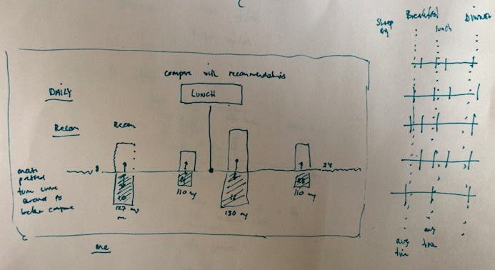
On this sketch, the four measurements are displayed with white bars, whereas the recommended guidelines are displayed beneath for comparison.
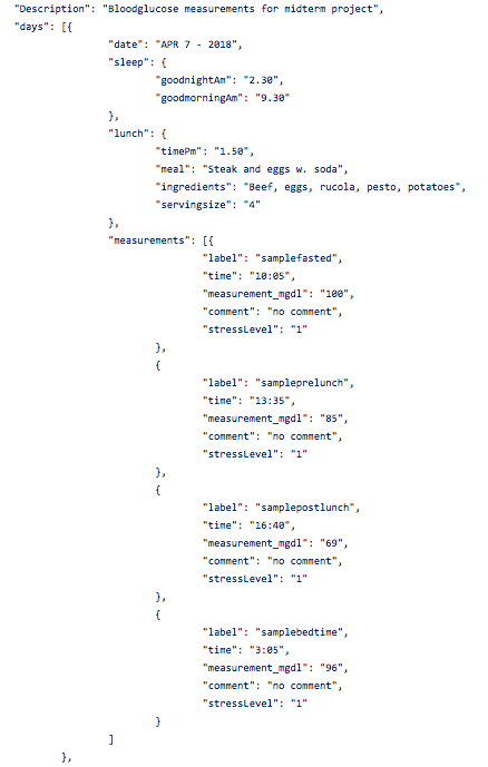
It took some attempts to organize my .json file correctly. Not only did I note down my measurements each day, but
also the amount of sleep, what times I ate, date, stresslevels and lunch ingredients were recorded. The blood glucose measurements and the corresponding times were my main data. In order to make them comparable and make the site dynamic I
placed these results in an array for itself. This would make it possible to loop through the “measurements” and display
“timeslots” based on the arraylength. The structure is displayed in the following image.
When building the structure of my page I wanted it to be dynamic so that when more days were added to the datafile - the days would automatically get added to the page. When searching through charts to display my results I was inspired by an image containing a lot of circle charts - and decided that I wanted to do something similar. First, I set up the structure of my layout using css and html.
When this was setup I had to incorporate my charts donut charts that I found on the chart.js site into each box. This took some adjusting. When all charts were in place I had Sam Slover provide me some inputs regarding the design of the page: how to best display the measurements and compare to the guidelines. He suggested that I made multi-donut charts to make the results easier to understand.
The final result can be seen here: DISPLAY
The code can be found here: CODE
Future thoughts: For the final my plan is to develop this page further. As we are currently learning about databases I am considering hooking the page up to a data base. That way you can enter your daily data, and it will automatically display on the screen.