Computational approach to typography
 - November 07, 2018
This weeks assignment was to create a computer program that produces asemic writing. The program could imitate the motion of physical writing or suggest the appearance of written language.
In class we discussed asemic writing - “writing without meaning”. We discussed at which point markings to a page/surface, scratches or tears might actually constitute letters or writing.
This made me think of the spacing of letters and words - as well as symbols being organized along a path to be important factors to distinguish text from an image (Although I could probably find a text that did not fulfill these requirements).
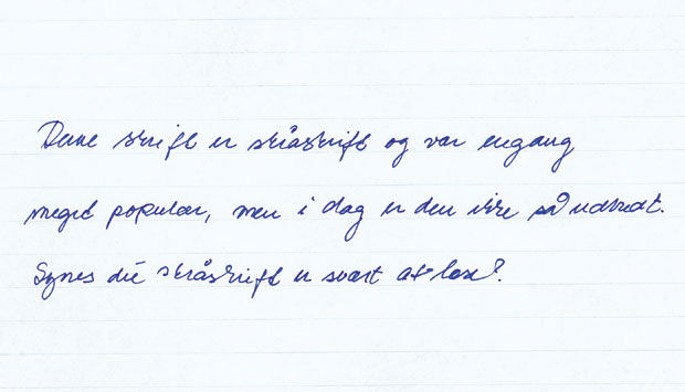
Anyways, for this weeks (not so successful) assignment I wanted to make use of spacing and the “path” of letters - to try to simulate the physical handwriting of what we in Denmark call “skråskrift” which I believe is translated into “italics” in english.
I was going for something like this.

First of all - I think this type of writing is beautiful. I looks like random curves being connected with spacing between some of them.
I was hoping to achieve something similar using perlin noise. I wanted to create a bunch of random objects with spaces - following a straight horizontal line to imitate the above image. A timer would separate the letters/words, as the writing was moving to the left. However - I wanted it to be done in a way so that you could follow the writing as it was created - almost like an invisible hand writing in the browser window.
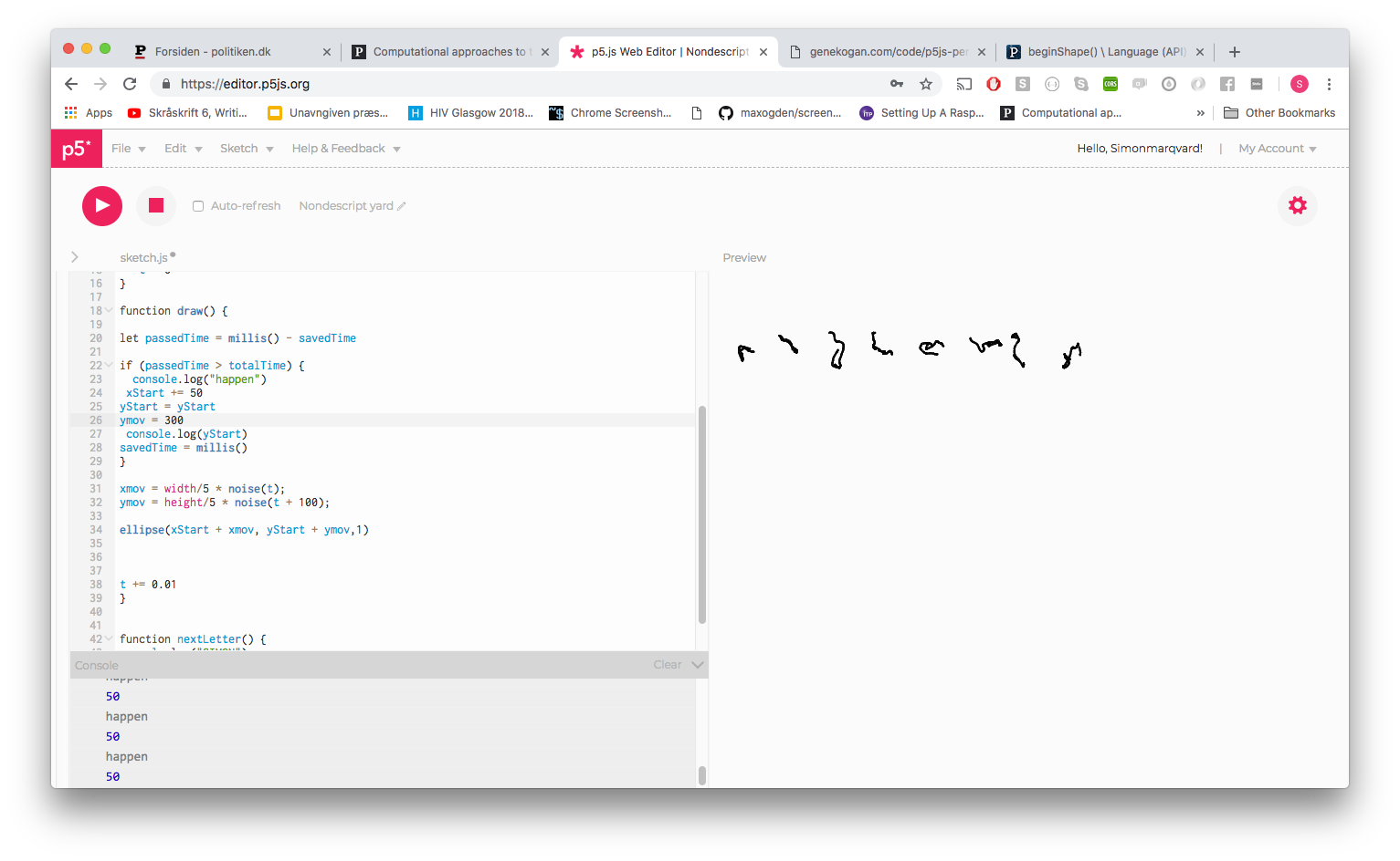
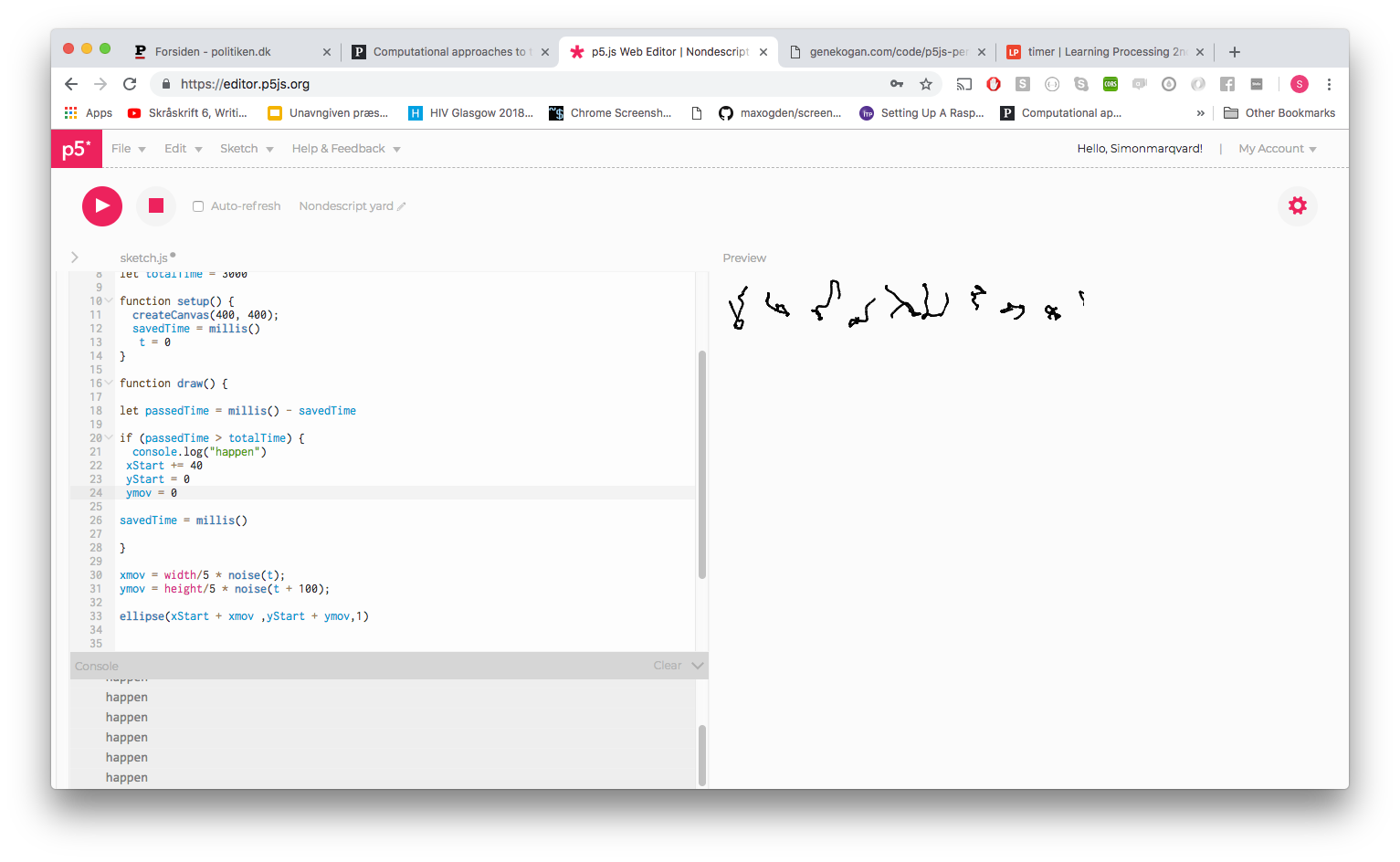
It didn’t go well. I couldn’t get the letters y position to align. While working in it I ran out of time. This is how far I made it.


Link can be found here