Glucose Project
Blood glucose planner and visualizer
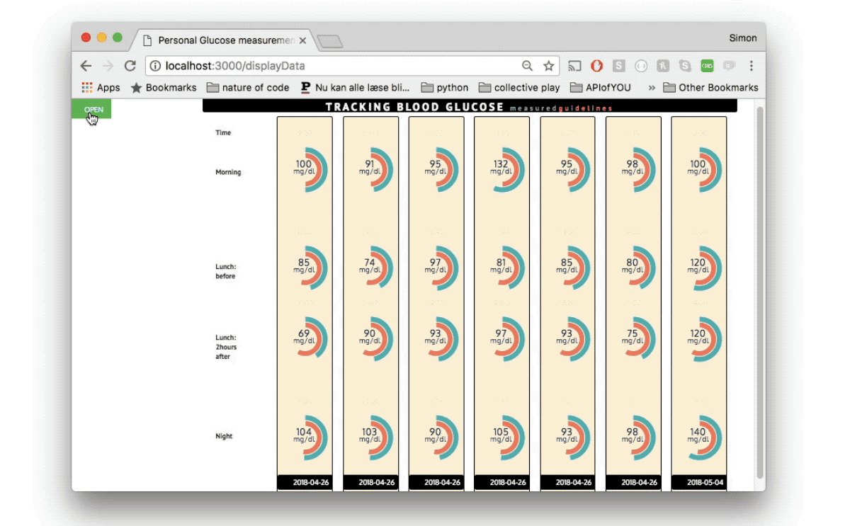 The layout from my glucose project. Each day is represented vertically.
For each day there are four measurements represented by charts. The charts
show your values (green) and compare them to the recommended guidelines
(red).
The layout from my glucose project. Each day is represented vertically.
For each day there are four measurements represented by charts. The charts
show your values (green) and compare them to the recommended guidelines
(red).
A data visualization project displaying blood glucose values and comparing them to recommended guidelines. Using the button in the corner of the display you can add your daily measurements and timepoints to the 'calendar' that will dynamically expand to fit the added measurements. Pressing submit stores the data in a Database (MongoDB) attached to the Heroku app rendering and deploying the program. The charts are doughnut multi charts from chart.js. And everything is stitched together using javaScript.
The idea for the project originated in a class where we had to collect data about ourselves and create a meaningful visualization for it. From curiosity I chose to collect blood droplets every day using a blood glucose kit bought on the internet. The purpose was to investigate my blood sugar levels during a stressful week where sleep, exercise and healthy food is often neglected. I collected my measurements four times every day for a week: Morning, before lunch, after lunch and before going to bed.
The project can be seen here (Note: the sketch was built for a bigger display. To get an optimal view, zoom out)
More information about how the projects was created can be found in my first blogpost and my final blogpost about the project.
Sourcecode can be found on Github.